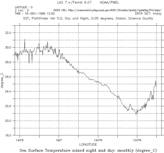
Looking at SST Another Way
Researchers use orbiting satellites to collect data and provide “snapshots” of sections of the ocean. During an El Niño event, it is important to have different tools to understand how SST changes. In the last activity, you looked at maps displaying SST over a large surface area in the Pacific Ocean. Now take a look at the same data, but this time using a graph along a single line of latitude from west to east. Both the map and the graph are useful for interpreting data and understanding an El Niño event.
Use the graph below to check your understanding. Then try making your own graphs of sea surface temperature using real data.